Financial Research Project
Analyzing Risk Metric Stability between 1950-2020
From Fall 2021 to Spring 2022, I worked with Dr. David Ikenberry at the CU Leeds Business School to do research on how risk to financial assets (in particular, stocks) changes over time. We looked at 3 metrics: volatility (which is the standard deviation of a stock’s weekly returns), correlation between pairs of stocks, and market exposure (essentially, how closely a stock’s returns follow the market’s). The particular question we were answering was how stable these metrics were between 6-month periods, or how far they moved from their previous values.
Technical Details
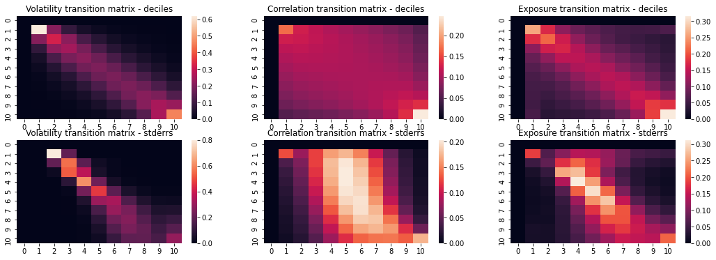
To do this, we took stocks with a market capitalization over $10mil (in 2020 dollars) from 1950 to 2020. We then calculated each metric, for each stock, for each 6-month period. Each period’s data was discretized into 10 bins, both by decile and standard error. We then used Markov modeling to analyze the data’s stability; in short, we calculated the probability that a stock would move between a given pair of bins (e.g. 10 to 9, or 5 to 7) from one period to the next. This probability was then visualized using a 10x10 heatmap, with “hotter” colors corresponding to higher probabilities.
Tentative Findings
While our results haven’t been fully analyzed/peer reviewed/published yet, we have seen some interesting trends in the data. Overall, all three metrics tend to be pretty stable between periods; a given stock has a high probability of staying in or near the bin it’s currently in. Across all three metrics, stability has seemed to increase since 1950, with particular increases since 2000. The heatmap results for the entire study duration (1950-2020) are displayed below. The top row of graphs were discretized by deciles, and the bottom row by standard error. A given cell (i, j) contains the probability that a stock moves from bin i to bin j from one period to the next.
The stability is evident in the strong diagonal line visible in (most of) the heatmaps, meaning that a given stock has the highest probability of staying in or near its current decile in the next period. The interesting case is the graph in the middle of the bottom row, representing correlations discretized by standard error - the stability isn't evident until the higher deciles, and below about the 5th decile, the strongest tendency is for stocks to revert back to the average level of correlation with each other. This could mean that strongly correlated stocks are correlated because of deeper factors, while weakly correlated (or strongly anticorrelated) ones are due to more transient factors.

This was a really interesting project. The intersection between this and my internship at Catfund gave me the chance to see both how research gets done in an academic setting, and how the results of that research can get applied professionally.